Expanding our mental model of flattening the curve to make sense of the uncertain road ahead
The “flatten the curve graphic” and message are mainstream news here in the United States. Stephen Colbert issued his opening monologue from his bathtub while his studio was closed, and brought along the most famous chart of 2020.

Harry Stevens’s animated explainer in the Washington Post is the most-viewed page of all time on the paper’s website. Perhaps this helps to make the case for greater investment in data visualization expertise in newsrooms and beyond: charts and maps make information accessible and interesting.
The infographic version of “flatten the curve” has been reinterpreted a number of ways (including with cats and baby Yoda). Most iterations are conceptual graphics though, not rooted in the actual case counts of COVID-19. Opinion articles have proliferated, speculating on what the future holds for the United States: Can we turn a corner? Will the economic fall out be worse than the the human toll of the disease? How long does this “social distancing” thing need to continue?
Now, our challenge is to figure out how this infographic translates to real life.
We need to start to grapple with the reality that the actual “curve” of COVID-19 won’t be as smooth as last week’s infographics may have implied.
The flatten the curve infographic is a mental model we’ve all had the opportunity to internalize. But “all models are wrong, some are useful” applies here just as much as in complex mathematical modeling of cases and deaths.
The focus in the US seems to be on when we’ll hit our peak.
But here’s the thing about peaks: You often can’t tell where they are until you’re already past them, on your way down the other side.
And in a country as big as the United States, the peak will be not so much a single curve as it will the sum of many curves — as the outbreak spreads to different cities and regions at different times. (Washington Post)
In the next few weeks and months in the United States, we’ll watch the actual epidemic curve be plotted by journalists, experts, and armchair epidemiologists around the world. Here are four things to remember as we continue to track new case data.

1. Many factors will shape the curve.
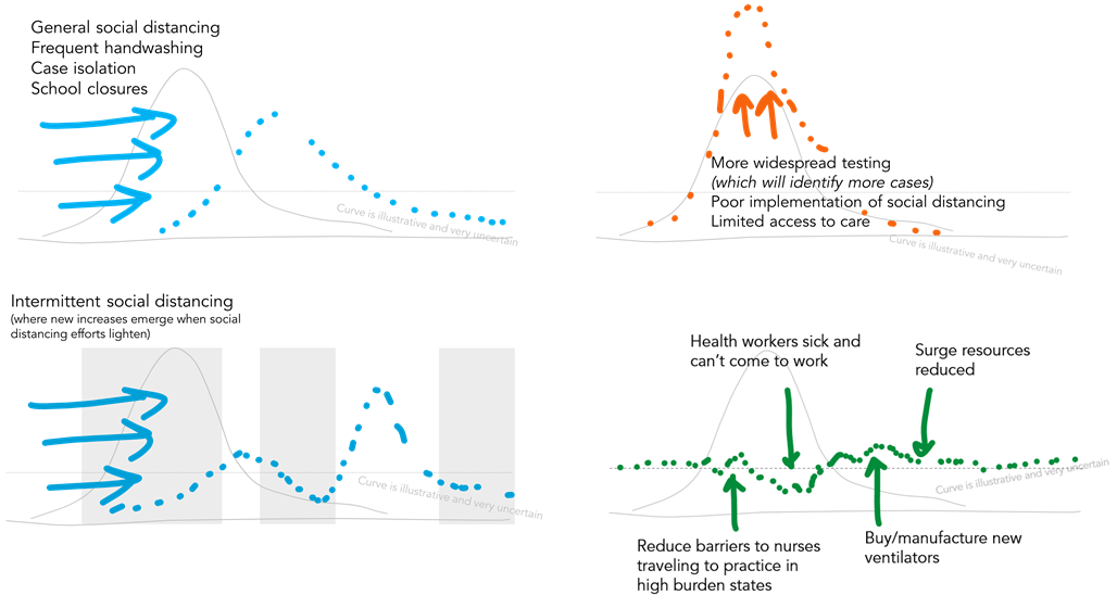
Most iterations of flatten the curve focused on showing two curves and a dotted line for healthcare capacity. These simple versions of the chart allow us to focus on the peak and whether it exceeds the line for capacity.

Those curves plotting new cases don’t exist in a vacuum though. Animations and more complex iterations of the infographic (like this animation by Alexander Radtke) highlight the various factors that can shape the curve.
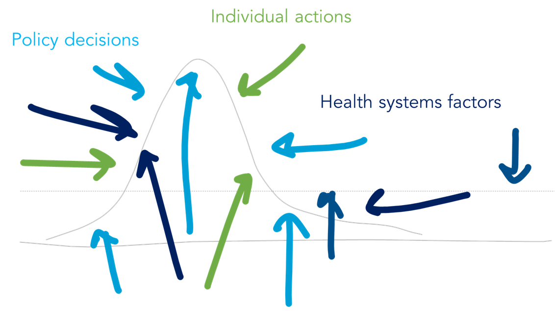
Discovering an effective treatment could reduce severity of some cases and demand for critical care beds, while poor implementation of social distancing could cause an earlier spike in cases. More testing could translate into a spike in case counts simply because we’re testing more people and identifying more positives. Even the healthcare capacity line can be fluid — we can mobilize surge capacity and allocated healthcare resources to change that threshold.
Social distancing and other individual actions
Researchers have started to explore how our different social distancing efforts may impact the trajectory of COVID-19. Multiple papers have explored what different mitigation and suppression strategies could do to the disease trajectory. The Lancet and Imperial College look at country strategies, while IHME evaluates the impact at the state level in the US.
The now-famous flatten the curve infographic helps us make sense of the charts in new research papers. While the shape of the curve looks different, we know what to look for: Where does the curve exceed the line for health care capacity?
Models like this challenge the idea that there are only two potential paths forward — just look at the way the line wobbles and changes over time.
Health system and policy factors
More than a decade ago, the WHO introduced the Building Blocks of Health Systems framework, which highlights fundamental components of a health system: service delivery, health workforce, health information systems, access to essential medicines, financing, and leadership/governance. These building blocks underpin health care access, coverage, quality, and safety.
Resilient health systems may be better able to manage through the shocks of COVID-19, particularly when reinforced with individual actions like social distancing, rigorous hand hygiene, and case isolation.
The dotted line for health care capacity on the flatten the curve graphic is also shaped by many factors: available health workforce, drugs and equipment, financial resources to pay for the response, and more. For examples, if our doctors and nurses don’t have adequate personal protective equipment to be safe at work and are themselves infected, our capacity to deliver health care declines.
When we start to combine different approaches to individual social distancing, policies on case isolation and testing, and complex health systems factors, we can start to see how different pressures could move and shape the curve.
Features of the virus and a whole list of other parameters
Interested in digging into the weeds a bit more? To explore the many disease-related parameters — including features of the virus itself, like changes in R0 — that could influence the shape of the curve, Dr. Alison Hill (Harvard) has created a great Shiny app which allows exploration of the effect of the various parameters in these models.
If the number of different parameters that influence the outcome doesn’t persuade you against using the available confirmed case data in a simple model, I don’t know what will.
2. Without better quality data, projections of the shape of the curve will remain uncertain.
In the US in particular, the quality of our COVID-19 data is significantly impacted by the availability of testing and knowledge about the burden of disease. The Atlantic details the timeline of decisions, which led to the reality that “even now, [testing is] that Achilles’ heel; it’s the crack that is making its way throughout our entire response.”
In many ways, we have failed at the “early detection, early response” advice of Larry Brilliant, an epidemiologist and physician who was on the front lines of the smallpox eradication.
He advocated for testing for early detection so that cases could be isolated and prevent the spread of disease. In his 2006 TED talk, he reflected on smallpox eradication efforts: “when we didn’t search [houses], we had the illusion that there was no disease” and pointed to evidence that our effective global response to SARS was thanks to early detection through the Global Health Information Network and early response.
Expanded testing will give us better data on who is infected, and enable better decision making about resources, continued social distancing recommendations, and other policy actions. More research about the SARS-CoV2 virus and COVID-19 will help us better understand how the pandemic could progress.
3. When social distancing / flatten the curve / stop the spread measures work, it will seem like we’re overreacting.
When public health measures are effective, fewer people get sick and fewer people die. As a result, when we plot the numbers, flattening of the curve of new infections in states with shelter in place recommendations may be met with one of two responses:
“If we aren’t seeing as many new cases, why do I have to stay at home?”
If we’re successful in flattening the curve, that means we’ll see fewer new cases each day, which can lure us into a false sense of complacency.
One of the biggest challenges we face in mobilizing broad social buy-in to what may feel like very restrictive measures is how invisible this crisis can feel. While we see articles and numbers on charts, most of us aren’t on the frontlines at hospitals and, thanks to limited testing, may not realize that we know someone who has fought the disease.
“We never saw a big spike in the cases — my governor / mayor / council member really overreacted with these Draconian measures.”
Measuring the impact of public health policies and interventions is challenging: when they work, fewer people get sick. This is by design — but may make it seem like policymakers overreacted.
Everyone: Why did they close all the offices and restaurants and schools and make us hide at home, hardly anyone even got sick!
Epidemiologists: Right, that was the idea.
Everyone: I mean, no one I know died. Total overreaction to this whole situation.
Epidemiologists: …
When the curve flattens, we’ll want to go back to life as usual. Those choices will need to weigh the risks of driving up new infections when social mobility ramps back up, the economic impacts of leaving so many businesses shuttered, and other factors.
4. Our obsession with watching the curve overvalues its certainty.
The two words that have defined the past two months for me are “unprecedented” and “uncertain.” The scale of this pandemic is unlike anything many of us have seen in our lifetimes. The information we have about the virus, the pandemic, and the future is full of uncertainty.
It can be tempting to watch the case count climb. But is watching the daily shape of that curve serving you? What will you change about your day to day life based on seeing X new cases emerge across the country (or across the world)?
We know that the shape of the curve will not be smooth and steady like our models depict, so watching hourly or daily updates won’t necessarily let you make assumptions about how “well” we’re doing, or what will happen in the future.
Right now, the most important decision we can make is to stay home, slow the spread, shelter in place if it’s advised to do so, and find moments of joy where you can.
In a world of information overload and endless new charts, it can feel hard to detach (I know I feel that way many days), but managing our way through this unprecedented world event is a marathon, not a sprint. Stay informed, share useful information with family and friends, and recognize what data serves you in this moment.
Find the rest of Nightingale’s coverage of the coronavirus pandemic here.
Amanda Makulec is the Senior Data Visualization Lead at Excella and holds a Masters of Public Health from the Boston University School of Public Health. She worked with data in global health programs for eight years before joining Excella, where she leads teams and develops user-centered data visualization products for federal, non-profit, and private sector clients. Amanda volunteers as the Operations Director for the Data Visualization Society and is a co-organizer for Data Visualization DC. Find her on Twitter at @abmakulec.
Many thanks to Alyssa Bell for her excellent edits for clarity and cohesiveness.